When Grant Langston was named CEO of the online dating service eHarmony in July 2016, he’d been with the company for nearly 18 years. He arrived at that corner office with his list of changes already in hand.
“One of the benefits of getting this job, having been here a long time, is that I don’t need six months to investigate and figure out what I want to do,” Langston says.
The company has just moved past one major milestone on Langston’s change map, revealing a new visual identity. eHarmony has used its name as a logo since it was founded at the dawn of online dating in 2000. It’s gone through several permutations since, always relying on font and letter colouring to make the name itself stand out. The new version marks its most drastic evolution yet, focusing on a heart design and making the name secondary.
![]()
A new logo had been on that to-do list of Langston’s from the beginning, but he knew he had to update the company’s offering before presenting a new face to prospective users. A new look on the old product was not an option.
“Our product in July 2016 was like a time machine back to 2008,” he told strategy. “Previous regimes were not really that interested in that part of the business. ‘If it’s not broke, why mess with it? Let’s focus on marketing and matching.'”

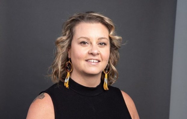
Grant Langston
With younger potential clients likely getting familiar with online dating via free apps like Tinder, which offers quicker access to single people, the market is shifting. eHarmony stresses that it helps build relationships as opposed to dates or other more frivolous connections, and Langston says complexity has become part of its brand. At one point it tested a drastically streamlined experience (taking its famous 450-question survey that begins its matching process down to 50 questions), and while it found more people completed the full induction process as a result, fewer people actually signed up. Users expect more from eHarmony compared to competitors, he says, and the company must embrace that its more rigorous client interaction is a part of that.
Still, he says, while the old version of the product had brought in 54 milion users, “the experience was quite old fashioned.” Langston charged his organization with streamlining and modernizing the user experience. It has since reducing that 450-question survey down to 150 questions (relying on machine learning to do more of the matchmaking process) and added a dashboard to its main user interface that shows why a person gets matched as they do. eHarmony is in flux, and the job isn’t done yet.
The new logo

eHarmony’s previous logo iteration.
As with any logo update, Langston was striving for something modern and fresh, but also wanted something that hinted at the brand’s complexity.
“When I look at the heart, it looks like a mosaic to me. When I think of all the things we do to bring people together, all the little pieces that we fit together, it’s like a puzzle. A lot of eHarmony’s job is about deep, simple, eternal things: love and connections. But there’s also a different side about complex technology and the complex human minds that we fit together in a way that works. That’s tough to communicate with a logo, but that’s what we’re after.”
The overall logo redesign was handled in-house by Shaily Savla senior manager of creative services at eHarmony.
Changing the media mix
eHarmony “walks a thin line” with its user base. Having long relied on a slightly older-skewing customer base, Langston says urban youth likely don’t see eHarmony as the right fit for them, preferring newer free apps and a quicker path to results. “We could turn this brand on a dime and become the hippest, most urban, most millennial brand in the world, but we’d lose that 50-year-old Oklahoman.”
From a media spend perspective, Langston says TV has been “fabulous” to get the word out to this broad target group. “We continue to run our old TV spots with our old CEO because they do well; it’s hard for someone like me to turn away from something that’s performing.”
However, “the ice floe is melting,” he says. His conversation with TV networks have produced a pattern over the last few years. “They have fewer users and the price has gone up.”
And while that conversation has mostly been with American networks, eHarmony’s new approach will be North America-wide. “One of the things we’re bullish on is radio. We used to be a big radio advertiser 10 years ago, but radio just seemed to shrivel up and lose reach. But now with satellite, podcasting and terrestrial radio, we’ve got reach that’s priced right and it still lets us tell an evocative story. Our advertising works best when our users can say ‘I fell in love.’ Display doesn’t work like the real human voice.”