 Calgary Women’s Emergency Shelter unveiled a new name and comprehensive brand evolution that includes a completely new name: FearIsNotLove.
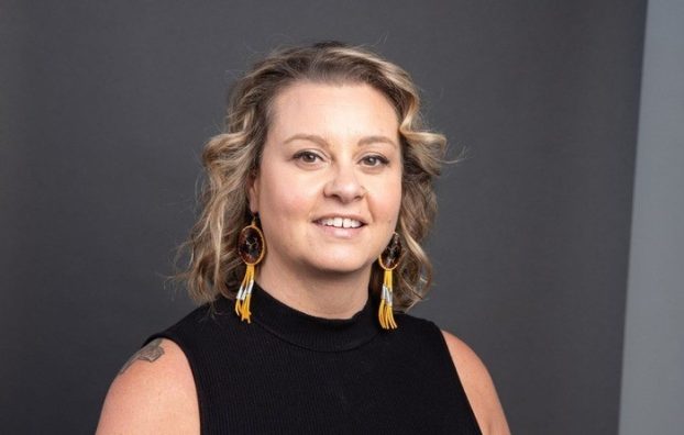
After more than a year’s worth of researching, focus groups and interviews Kim Ruse, CEO of what is now known as FearIsNotLove, concedes that was she was taken aback by the overwhelming perception that the name was irrelevant.
She tells strategy that every word in its name needed a change: “Calgary,” because services are rendered in other locations; “women,” because the organization offers a considerable array of programs for men, children and youth; and both “emergency” and “shelter,” because the breadth of programming extends beyond those two areas. According to Ruse, the emergency shelter program now accounts for just 5% of all intake.
“Our clients were telling us that when they were looking for help, they didn’t think to call us until they needed a shelter, as the name was stigmatizing,” Ruse says. “It was an overwhelming response from clients.”
FearIsNotLove will maintain the organization’s long-time core offerings: Calgary Women’s Emergency Shelter; Child, Youth & Family Program; Community Services Counselling Program; Healthy Relationships Program; Court Program; Men’s Counselling Services; the Connect Domestic Violence & Abuse HelpLine; and collaborative work with government agencies and many community and non-profit partners.
[iframe_vimeo video=”755701138″]
The concept of “FearIsNotLove” calls out the all-encompassing, paralyzing fear that can terrorize any person and the organization says it will eliminate confusion and disconnect between the organization’s name and the true role it plays in the community. “The umbrella [term] gives us the flexibility to be more inclusive,” she says.
“When most nonprofits rename, they generate a new name and we decided to generate the name of a movement,” Ruse adds.
A name change is a difficult process to take on, especially for an organization with brand equity going back nearly half a century. As Ruse explains, when Calgarians say “the shelter,” her organization is what they are referring to.
The organization has a historic place in the community, and Ruse says the brand evolution is intended to make it easier for Calgarians to identify, relate and connect with the broader social change we are working towards.
[iframe_vimeo video=”755704951″]
The yellow and charcoal is about being a warning and the gravity of the issues the organization deals with, but to also be welcoming. The line symbolizes a life line, demarcating fear and love. The colour scheme is coming to life through recent social posts.
Vitreo Group is the Calgary shop that helped do the work. The agency is mostly focused on fundraising and philanthropic positioning.
[iframe_vimeo video=”757697603″]
The campaign letting people know about the rebrand is the largest the organization has run since 2012.

