J.P. Wiser’s is an old brand that’s getting a new look.
The 165-year-old, Corby-owned distiller has undergone a transformation, partnering with international design agency JDO for a new and revitalized image for the whisky.
The redesign took roughly 17 months, from the initial brand discovery phase with JDO to rolling out core SKUs, which began to hit shelves in August. With JDO’s help, the distiller says it “raise[d] the bar and elevate[d]” its packaging while maintaining elements of the brand’s longstanding legacy.
Caroline Begley, Corby’s VP of marketing, says it took inspiration from its eponymous founder and Wiser’s spirit of self-assurance, boldness and authenticity.
“With this design refresh, we’ve focused on shining a light on the heritage J.P. Wiser’s has established since 1857, all the while giving it a modern and distinctive look,” says Begley.

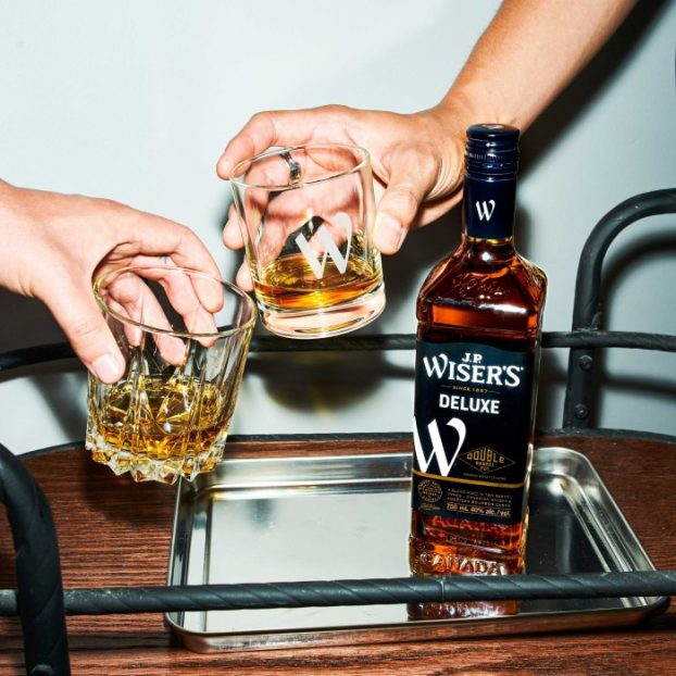
The brand refresh “exudes simplicity and confidence,” with an updated logo that features modern typography and a colour palette that pays homage to J.P. Wiser’s industrial origins.
This is coupled with two new brand symbols: a prominent “W,” which will be a common thread in the J.P. Wiser’s family, and an icon of a horse rearing over a barrel, a nod to the brand’s past. There’s also a quote from founder J.P. Wiser: “Horses should hurry but whisky must take its time.”
“The re-stage has already begun its roll out across the J.P. Wiser’s brand,” says Cory Owens, senior brand manager at J.P. Wiser’s. “This includes on social, in-store, above-the-line comms, and soon to go live on our website and brand home in Windsor.”
Owen tells strategy the distiller is currently in the process of putting the finishing touches on its higher “marques” (distillate recipes) range, which will be complete by the end of November.
The J.P. Wiser’s brand last underwent a change in 2017.