Kelsey’s is putting a fresh face on its more than 30-year-old brand image.
The Cara-owned restaurant, working with multidisciplinary design consultancy Breakhouse, is in the midst of a franchise-wide transformation as it seeks to strengthen ties to millennials by returning to its roots as a bar-focused social gathering place for young people.
Anesie Johnson-Smith, senior brand manager for Kelsey’s, says since it opened in 1978, the casual dining brand had adapted to match its user base, aging along with its customers as they went from being young people to couples with kids.
“It was time for the brand to reset and attract a new user base for the future,” Johnson-Smith says.
She says Kelsey’s saw an opportunity for the brand in a market divided between value driven and increasingly upscale restaurants.
“In a market segment where restaurants are starting to increasingly converge visually and in terms of food and service offerings, we are trying to do something different,” she says. “We recognized an opportunity to become an unpretentious, vibrant, social gathering…where the four walls aesthetic and service package are different.”
The changes are on display at 1011 The Queensway in Toronto, which has been re-built and reopened in December with a new logo, menus, signage, uniforms and messaging. In addition, Johnson-Smith says a new culture, centred on core brand values, was rolled out to employees so they could deliver on the design’s promise of a social and unpretentious dining experience. So far, customer response at the Toronto location has been positive, Johnson-Smith says. Kelsey’s plans to roll out the changes to all its locations in Ontario, Manitoba and Alberta over the next five years, starting with four spots in 2014.
Work on the redesign began in January 2013, with the brand and agency examining winning concepts in other markets, including Europe. Agency staff visited several Kelsey’s locations while also assessing the present and future restaurant climate, says Allegra Snyder, managing director at Breakhouse. She says the agency got the sense that Kelsey’s was a plucky brand with a lot of hardworking people who were also always ready to have some fun. It wanted to bring out that spirit in a fresh way while paying tribute to the history of the restaurant.
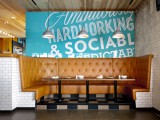
The result is a brighter and more open look and feel with bright colours used across the menu and signage, which features text that declares the chain “Ambitiously hardworking and socially unpredictable.”
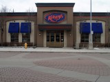
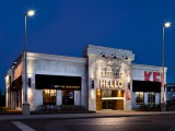
The exterior of the building, once dark-brown brick with blue, red and neon signage has been replaced by lighter brick and a giant, Vegas-style “Hello” sign above the front door along with the “Ambitiously hardworking” slogan. The brand name, in block-type red, wraps around the right side of the building.
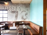
Inside, Snyder says the bar, located near the front door of the restaurant, is at the heart of the redesign, configured to create a welcoming atmosphere. A hanging light fixture in the bar area spells “H.A.!” for happiness always.
“We wanted to ensure the spirit of the place remained intact while bringing a freshness to it,” she says. “We want guests to know Kelsey’s is a destination for fun and social times and its friendly and approachable, which was the inspiration for the material and the pallette, to bring a lot of new life into it.”
Breakhouse also launched a radio campaign on Jan. 27 in Ontario as well as direct mail mid-January to promote a new menu in Ontario under the slogan “Don’t Worry, Eat Happy,” and will work with Cara on a Kelsey’s social strategy set to launch in May.


