Have you ever been to a party where somebody walked through the door and everyone turned their heads and stared? You know why? Their outfit.
You can call it superficial. I call it human nature. We’re wired to pay attention to things that catch our eye and ignore the rest. Our brains work too hard to process every peripheral detail; we only register the things we need to see (immediate task at hand), things we need to watch out for (potential danger) or things we find irresistible.
There are thousands of items in the average grocery store. The only way a consumer can do her shopping without going insane is to subconsciously deselect your product and cast it as “peripheral detail,” allowing her to find her usual product easier and faster.
Luckily, there’s a shelf-makeover solution: retail-ready packaging (RRP) – trays and other displays that are strong enough to transport goods but attractive enough for the shelf.
I work in Europe, where RRP has been around for a while. I’m sure when retailers first mandated it, manufacturers groaned. But somewhere, a brilliant marketer saw it as a chance to turn this “stock-holding carton” into something more. Today, all brands in Europe design RRP as a core component of the marketing communication wheel.
Quick test: how much time do you spend finessing the body copy of a print ad? How many consumers will see that? Now, how much time do you spend designing your RRP? Beyond primary packaging, your RRP is the only touchpoint that 100% of your consumers see. Studies in Western Europe have shown that effective RRP with the right claim can increase sales by 5%.
So how do you create great RRP?
BE DISRUPTIVE
Design bold and innovative RRPs that utilize strong colours and different die cuts. If you’re in beauty care, splurge on premium materials to create that salon feel. If your brand has more than one RRP on shelf, design it in that context. Pringles created a design that links one RRP to another, creating a block on shelf and enabling huge Mr. Pringles branding that couldn’t be achieved on a single pack or with one RRP.
BE RECOGNIZABLE
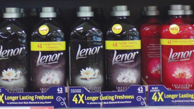
You can dress up like Elton John for a party and get noticed, but you wouldn’t be on equity. Coke wouldn’t be recognized from afar with a yellow polka-dot RRP, even though it pops. Leverage the design cues of your brand – colours, font type, iconography – so the RRP instantly triggers your brand in the shopper’s mind. For instance, the Vanish stain remover RRP, by mirroring the distinctive pink packaging, leaves no room for brand misattribution.
BE SIMPLE
Keep the RRP clutter free. It’s tempting to put your logo on, but ask yourself, will it really make a difference? If not, you’ve just simplified the design to make the claim stand out.
Which brings us to claim execution. As a rule, keep it to seven words or less, remember that numbers jump out better than words and make the most important element the largest.
OVERCOME THE PURCHASE BARRIER
Make sure your claim addresses the barrier at shelf. Is it a value barrier such as, “You cost more than my current brand but you’re not offering more product”? Fairy, a dish liquid brand in Europe, has been driving a “Lasts 50% longer vs. private label” claim for three years straight. They realized that they didn’t need to talk about their POD, grease cutting, because consumers already knew it. At the shelf, the purchase barrier was value vs. private label. Without any marketing campaign, this claim alone on RRP (and stickered on bottle) grew sales 5% in the first year, and after three years, built value share from 50% to 55%. It’s also a brilliant example of prioritizing elements of the claim. All you really see is “50% longer.”
Great RRPs aren’t rocket science, but they do require some effort. By the way, I couldn’t help but notice – you look fantastic in that outfit today.
Chris Chan is a Canadian expat who used to work at P&G Canada and is now at P&G Geneva. For light amusement, follow him on Twitter @executive_guy.