Curling has an image problem – that it’s a bit corny and silly – something the sport’s sanctioning body wants to overcome.
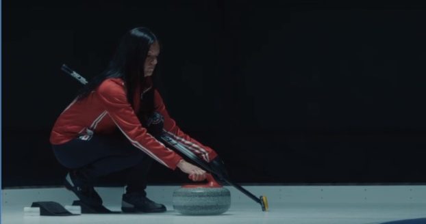
Curling Canada’s new work, “Season of Champions – A Stone’s Throw from Victory,” is intense and gloomy to better showcase the game’s drama, taking conspicuous visual cues from sports that are more conventionally construed as cool and athletic.
“We’ve relied a lot on humour in the past, but this year we wanted a shift in tone,” says Nolan Thiesson, Curling Canada CEO. “The ‘Season of Champions’ is no joke. It’s an important moment for these athletes … and we wanted to give them the recognition they deserve.”
Curling and its stars like Kerri Einarson and Brad Gushue, who are heroed in the two spots, deserve to receive more reverence and respect, says John Osborne, group creative director at Cossette Vancouver, the shop responsible for the work.
“On the surface the sport unfairly or not, does not appear in the same way that football, soccer or hockey does,” he says. The campaign solution, therefore, has visual language more in common with the likes such brands as Nike and Under Armor.
The new aesthetic focus gives a “drastic contrast” between the sport’s expectations and execution, he says, and is all about getting into the mindset of a curler setting up for a game-winning shot.
The line it has to walk, Thiesson notes, is not alienating existing fans, but also bringing newbies and new Canadians into the fold by being “true and authentic” to curling.
“Hopefully, we’re going to get a younger crowd really interested,” he says.
The campaign is timed to coincide with the Scotties Tournament of Hearts, running until February 25, 2024 at the WinSport Event Centre in Calgary.
Curling Canada’s new campaign launched on television both nationally (TSN) and locally/regionally (CTV), as well as on various local radio stations, digital OOH and social media.
The ad spend year over year remains constant, with Cossette Media behind the buy.