As the team here at strategy prepares to devolve into a life of sugar-only diets and overall laziness for the next 10 days outside the office, we’ve decided to take a few moments to reflect on the year gone by and leave our readers with a list of our personal favourite campaigns from 2016. Hopefully, this will tide you over until 2017, when we’ll be back in action.

Rethink Breast Cancer, “Give-a-Care” (Lg2)
Watching a loved one go through cancer treatment is painful, emotional and sometimes, quite frankly, awkward. And that’s just for the person on the outside.
As an onlooker, it can be extremely difficult to know how to be there for the person you care about or have any kind of understanding of what they’re going through. That’s why I have a lot of admiration for the innovative thinking behind this project.
Rethink Breast Cancer and Lg2 worked with the organization’s network of women to select useful co-branded products that women going through treatment would appreciate, with irreverent but informative names.
I also appreciated the deliberate lack of pink-washing with this line. Supporting this line isn’t passive – those who buy the products can support a cause but also learn something about a woman’s experience with cancer and can give a gift that’s a little more meaningful than a get-well card.
Cheeky, beautifully-designed, insightful and useful. Just what a gift – and a campaign – should be.
Harmeet Singh, editor, strategydaily

City of Montreal, “Montreal Anti-Littering Campaign” (Quebecor)
Most advertisers probably wouldn’t want the words “piece of crap” uttered anywhere near their campaign, but for the City of Montreal’s recent civic cleanliness campaign, a big hunk of dog doo was an instrumental part of the creative.
The outdoor campaign, which saw transit shelters enveloped in 360-degree trash, was designed to be as in-your-face as possible. From ratty old mattresses and furniture to discarded over-sized pieces of food, the campaign was about as far from pretty as you could get. But hey, so is littering. In a world where awareness campaigns are often soft, emotional and tugging at the heartstrings, it was nice to see something that incorporated a bit of humour without ever getting too far from the message at heart.
I’m not the first person to praise this campaign — it’s also taken home the grand prize at this year’s OOH Showdown from the Advertising Club of Canada, as well as the prize for the top street level, transit and/or transportation ad.
But it’s not just the trash that makes this campaign effective. Quebecor incorporated the deliberate use of “tu” as opposed to “vous” (for non-Francophones, “vous” is the more formal way to address someone in the second-person, while “tu” is more personal) in its written messaging such as “tes objets encombrants c’est gênant” (“Your bulky clutter is annoying”). The more conversational approach was a refreshing direction for an awareness campaign — our environment is an issue that we need to have a conversation about, not a lecture.
Plus, we can also take a moment to appreciate that Quebecor didn’t choose this campaign as a testing ground for sensory marketing?
Bree Rody-Mantha, staff writer, Media in Canada

Société de l’assurance automobile du Québec, “Pigeon” (Lg2)
The driving-under-the-influence PSA genre has been around for decades, for good reason. As consumer habits evolve, so do the targets, as in the Ontario Ministry of Transportation’s “Put Down the Phone” spot this year by John St., a deeply unsettling warning about the dangers of texting and driving (a different kind of influence). The intention is to shock, and it can be a jarring transition from the game or your favourite show or even other ads (like “Put the Phone Down” followed by an iPhone ad). But is it possible to create an effective PSA that you also want to watch?
Lg2 and the Société de l’assurance automobile du Québec pulled it off with the “Pigeon” spot, warning against the danger of driving high. It’s a caricature of the stoner, but one that most people who’ve used marijuana can identify with and recognize what a bad idea getting behind the wheel would be.
[iframe_vimeo video = “196439907”]
As the federal government moves to legalize marijuana by 2019, we can expect a lot of these ads in the decade ahead. They can’t all be this fun and effective, but at least we had “Pigeon.”
Mark Burgess, associate editor, strategy

YWCA, “#NeverBlameTheVictim” (Juniper Park\TBWA)
I’m a sucker for messaging that hides in plain site, and the YWCA’s Blamé “pop up store” was particularly good at it.
Of all the campaigns tackling violence against women to emerge over the last few years, this one felt the most confrontational to me, even though it lacks the literal, visceral effect of some of the more explicit campaigns. The YWCA did not use graphic images or a haunting soundtrack to evoke a response. In this case, whatever horrified gut clench you feel at seeing how society blames rape victims comes from within the individual.
Masquerading as a fashion retailer (complete with sparse merchandizing and glossy photography on the storefront), Blamé placed clothing and objects around a store that represented different ways people blame victims of sexual violence – the “Asking For It Crop Top;” “The Slutty Party Drinking Game;” a black dress next to a real-life tweet that says “If you go to a club dressed like a slut with your boobs & booty hanging out & you get harassed or raped, you were asking for it!!” (according to @lordevintage).
There is a video component to this campaign too, and it illustrates the messaging well enough. But where it is easy to become drowned in online PSAs within the bubble of our social media spheres, one cannot simply “like” or dismiss the pop-up store. It lures you in under false pretences and confronts you with clothes you may own, makeup you may wear or, worse yet, words similar to those you you may have spoken.
“People wonder Y they get raped at night , I mean have you seen the way your dressed tight blue jeans hair all pretty and stuff ha.” – @bwoodstheboss
The store’s logo is a great piece of hidden messaging on its own. The way the accent over the “e” in Blamé extends downward to cross out the word “blame” is a nice visual indicator that brings the viewer through the entire experience.

Jeromy Lloyd, digital editor, strategy, Media in Canada and Stimulant

Tourisme Montreal, “Sorry” (Lg2)
Oh, conscience-stricken Canada. There really is truth in the truism that paints the country as an apologetic one. And this campaign by Tourisme Montreal and Lg2 hilariously perpetuates that (with a little more cheek than we’re used to seeing).
There are several reasons why I deem “Sorry” one of the more creative campaigns from the year gone by. However, it’s worth noting that the tourism board and agency have (so far) managed to go up against Canada’s much-hyped 150th anniversary with a degree of dignity, having to compete for attention as the province itself turns 375 with a playful campaign that invites everyone in.
While at the start of the campaign video — which is essentially a gargantuan apology to Toronto from its neighbour Montreal for all the noise and fun it will be having next year for its BD — there is a little tension (which some could construe as being feisty, with characters handing out ear muffs to protect their ears from all the noisy fun they’ll be having), the organization successfully manages to remove any feelings of resentment from the province with a gift from partner Air Canada: two plane tickets to Montreal for those in the video to join in the fun. It then extends the invite to viewers, directing them to a digital hub to scan and plan around all the party-related things happening in the French city in 2017.
It’s all very smart and so very effective, especially in today’s current age of FOMO with that super important millennial demo who can’t resist a good “experience” — it doesn’t get any more relevant than that. Well done.
Jennifer Horn, managing editor, strategy

The Salvation Army, “Poverty Isn’t Always Easy to See” (Grey Canada)
The Salvation Army and Grey did a great job of showing the reality behind the highlight reel that’s so often seen on social media for its 2016 holiday campaign.
Using Facebook’s 360-image feature, the campaign aimed to highlight the issues of “hidden poverty” by showing the entire rooms where seemingly perfect family photos are taken. Viewers could explore the room by toggling and dragging the images, which contained the line “Poverty Isn’t Always Easy to See. Especially During the Holidays” on the walls.
The Facebook 360-image feature was also used to good effect this year by Kids Help Phone and J. Walter Thompson. That campaign used the draggable images to demonstrate behind-the-scenes bullying that occurs in schools. Here’s hoping the trend towards using new social media ad opportunities for good is one that grows in 2017.
Val Maloney, editor, Media In Canada

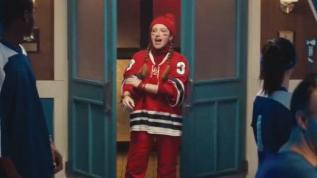
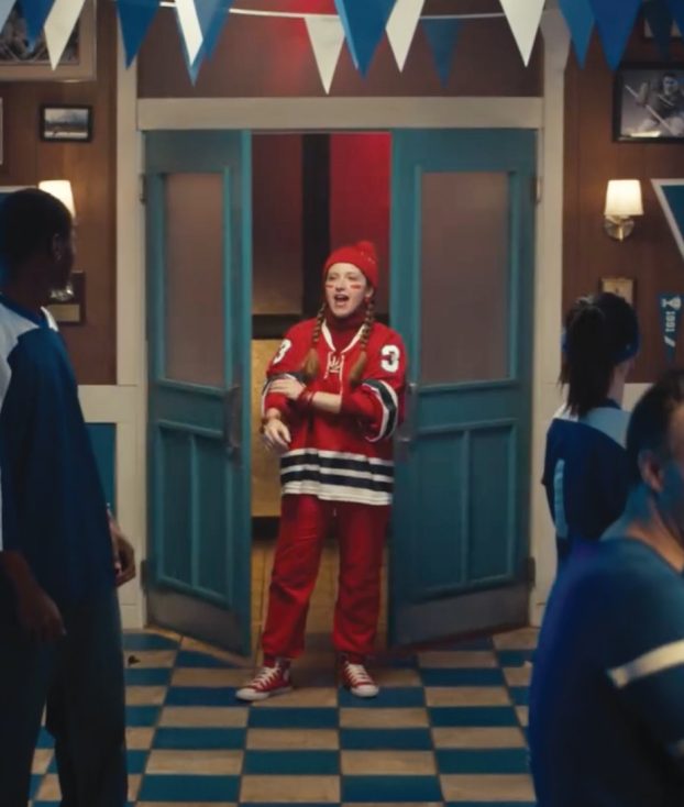
Sport Chek, “#WhatItTakes (Rio Summer Olympics)” (TBWA\Chiat\Day New York)
Looking back on the year, there’s a lot of work worth recognizing. Sid Lee’s beautiful spots for Transat and the Toronto Maple Leafs. Sandbox finding a way to make Dos Equis “interesting” without relying on a mascot that was wearing a bit thin. Rethink making a yelling, aggro dandelion puppet for Scotts’ that made me laugh harder than anything else this year.
But what really stood out to me from both a creative and strategic perspective was Sport Chek’s Olympic campaign. Sport Chek was in 2014 burned when one of their spokesmen was injured before the Winter Olympics, rendering most of the creative it had shot with him nearly useless. So for the Rio games, Sport Chek took the effort to set up a war room at the CBC. That gave it access to footage from the games moments after it happened in Rio, ensuring its creative was up-to-date with what Canadians were celebrating, from Andre De Grasse going head-to-head with Usain Bolt to 16-year-old Penny Oleksiak’s record-setting four medals.
Yes, the “rah rah” attitude and gritty aspiration of ads even remotely related to sports and athletics is becoming a cliche, but tapping in to the moments Canadians were talking about on a day-to-day basis made the creative stand out from the broad “strive for your dreams” message most others were using. And getting a professional spoken word artist to deliver the manifesto instead of the generic voice-over artist we’re all used to didn’t hurt either.
Josh Kolm, news editor, strategy